• Home
  • Handcrafted Cards
    • Challenge Cards
    • Quick Tips
  • About Me
  • Shop
  • More Creative Stuff
    • 3D Printing
    • Home Decor
    • Model Railroading
    • Preparedness
    • Sims 4 Builds
  • Recognition

Cricketleg Creative

Favorite Technique Challenge

December 11, 2020 Challenge Cards, Handcrafted Cards, Holiday Cards

This week’s Monday challenge from Simon Says Stamp is to make entries using your favorite technique.

favorite technique challenge

Well, hi!

Okay, this one was quite a, um, challenge. Not necessarily making the cards. Just trying to pick a favorite technique! I really had to think about this one.

What is my favorite technique?

In all fairness, I believe that this is something that will change with time and with new stamps, products, etc. So FOR NOW my favorite technique is ink blending. Especially for creating skies.

So here are my entries into the challenge, from least to most favorite. My most favorite really surprised me and reinforced a lesson I have learned this fall. More on that at the end.

Nutcrackers

Yes, I do love making skies but I figured if I made five entries with five skies that could get redundant. So I thought I would just use my favorite blending brushes to create a monochromatic background for my nutcrackers.

So first, I had to stamp the nutcrackers and mask them. Then I used a red, a cherry, and a dark green stamp pad to create the red background. Yes, green. Adding green just around the edges, and adding it gently, really deepened the shading.

After that, I added some metallic accents to the nutcrackers with a gold gel pen. I chose muted pastels to color each one in. An embossed Merry Christmas sentiment finishes the card, as well as embossed edges.

nutcrackers

Snowy Trees Sunrise

Sunrise or sunset? It could be either!

Recently I purchased a set of winter tree stamps from Inkadinkadoo so I used a few of them on this card. I did mask some of the snowy evergreens before doing the ink blending with the brushes.

When I make skies I try to reference a real photo, so the Google comes in handy for that. Helps me figure out how to order the colors.

I wanted this to look like a snowy morning and since the light is behind the trees, I used gray blue Copic markers to put most of the snow clumps in shadow.

A sentiment from the most recent Simon Says Stamp card kit (which just came today!) finishes the card.
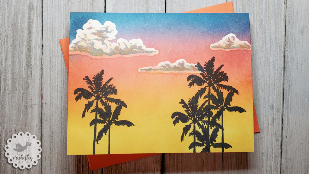
Tropical Sunset

Next year is my 30th wedding anniversary! Husband and I are planning a trip (crossing fingers for no Covid complications) to the U.S. Virgin Islands. And right now, I’m loving any reminder of that upcoming trip!

In a recent challenge, I used this same palm tree stamp for my scene. I just love the look of palm trees in silhouette. But this time I added some clouds using stamps and dies from a Hero Arts set. I used the cloud dies to create masked areas that I could ink blend over. Then, once the ink blending was done, I used the cloud shadow stamps to create dimension. Adding in some Copic marker shading helps the clouds look like they are reflecting some of the sunset colors.
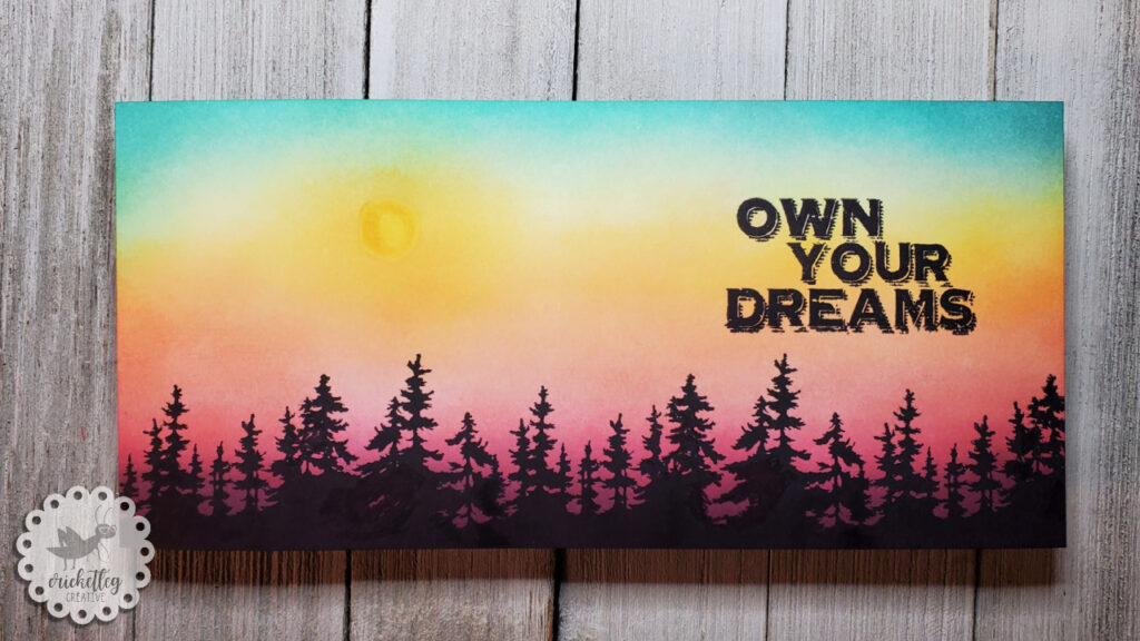
tropical sunset

Forest Sunrise

Or sunset. Again, who knows?

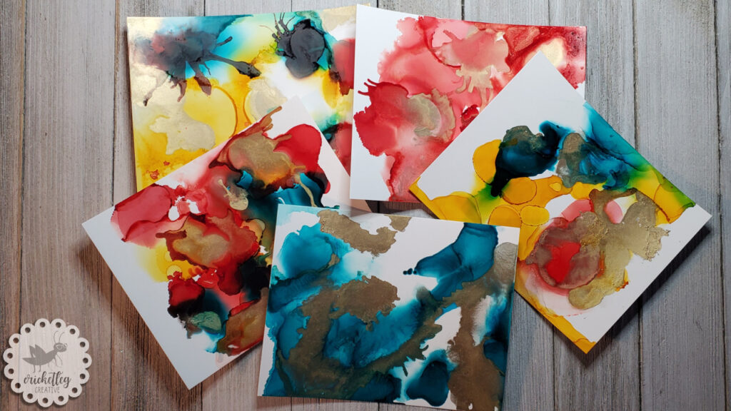
To create this slimline card I used stamps from the set that came with my alcohol inks kit. I was excited to use these as I’m always on the lookout for tree stamps!

alcohol inks

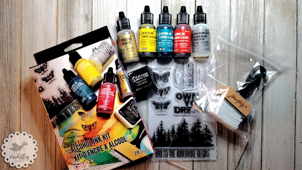
Unfortunately, the quality of these stamps appears to be less than great. When inked up, the tree line (which I love!) does not stamp well and leaves a big “ink hole” where it would not stamp no matter how hard I pressed! The “And So The Adventure Begins” sentiment stamp is crooked. I had to yank them off the plastic and they don’t stick well to acrylic blocks.

So, I had to fill in the ink hole with a Sharpie. That worked since I stamped in black for a silhouette effect. But what if I wanted to stamp in green? Sigh. Oh well.

Once I filled in all the holes (I stamped it three times across the bottom of the slimline card) I did my ink blending. Okay, that’s a lie, I did do a sun shape first. I die cut a small circle from a Post-It note and used that as a stencil to color in the sun with Copic markers. Then I ink blended from the sun outward.

Luckily, the other sentiment stamp in the set stamped fairly well. Still, disappointed in this stamp set.
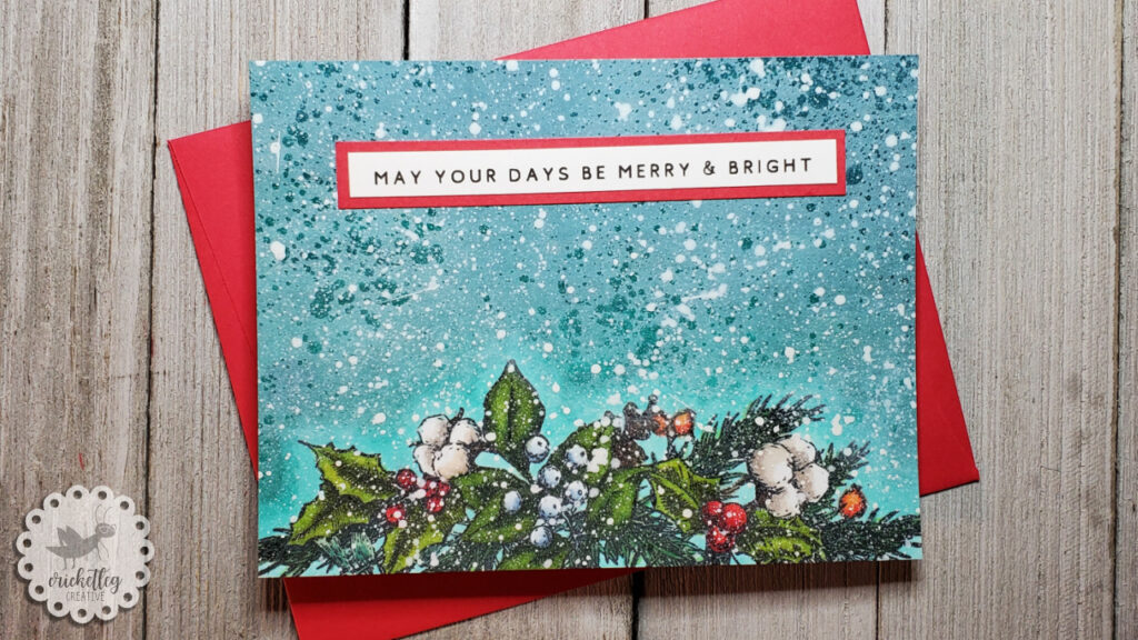
forest sunrise

Snowy Greenery

This one almost did not make the cut. Seriously. It almost went in the trash.

Here’s the 411…

I started by stamping the beautiful greenery stamp in this month’s Simon Says Stamp card kit. Such a great kit this month! I colored it in with Copics and then decided that for this background I would do some Copic blending! (FYI…I don’t know what that pom-pom like plant is in the stamp but this Southern girl thinks it looks like cotton….so it’s cotton. I mean, why not?)

Silly me, most of my markers are Ohuhu which are great for the price, but many are already too dry for blending (I haven’t had them very long!). I knew I wanted a kind of teal blend and once I started I just had to keep going even though a couple of my teal family markers were dying.

Hmmm. The blend was sucking pretty bad. So I thought I’d try a new product that I *thought* was for after inking. Um, no. It’s for before. So after I sprayed and it dried (and did nothing but add shiny blobs all over) I just about quit.

But, as I have learned in the last few months, you can often make lemonade out of lemons when it comes to card “fails” so I soldiered on. I tried ink blending white pigment ink over the blogs. Nope. That looked weird.

Well, I can always add snow splatter and see what happens.

And that did it. I watered down some white goache and splattered it liberally over the entire card surface. Sure enough, it covered my many sins and I think it looks great!

A computer printed sentiment mounted onto red cardstock finishes the card.

snowy greenery

And that’s a wrap!

Just a heads up, Mr. Snowy Greenery Card will be doing double duty by appearing in the Simon Says Stamp Wednesday Challenge theme, Let It Snow. He’s so beautiful how can I not use him twice?!

Y’all take care!

Leave a Comment Categories: Challenge Cards, Handcrafted Cards, Holiday Cards
Share :

“Alcohol Inks” Challenge

December 4, 2020 Challenge Cards, Handcrafted Cards

Simon Says Stamp challenge for this past Monday is for using Alcohol Inks! (And this will be kind of a part one, so stay tuned for next Tuesday’s post to see how it ended!)

Each Monday and Wednesday I look forward to the announcements for new themes. I’ve really come to appreciate the creative challenge it offers me.

However, this past Monday I was disappointed. Alcohol inks? Yes, they are cool. Yes, I want to try them. No, I did not have any.

So I decided I wouldn’t participate. It’s fine. I can try alcohol inks another time I guess.

Psych!

Well, I really did think that but when I was buying paper supplies for a church youth activity, I spied this little alcohol inks starter kit from Ranger at my Hobby Lobby.

alcohol inks

Hmmm. With the 40% off coupon I figured it was worth a shot. It comes with all that you see in the picture (regular price was $24.99). All I really needed were some colors, the blending solution, and appropriate paper. So the rest was bonus. This would give me a chance to play! Maybe I could enter the challenge after all!

A Word of Warning

Um, they don’t say to work in a “well ventilated area” for nothing, folks. I made myself sick.

The kit comes with 5 notecards to use. So I figured I’d quickly play with the five notecards and I was in my craft studio which I thought was a fine place to work.

Nope.

After three cards (and mind you, I worked quickly) I was feeling dizzy and, um, just weird. I stepped outside for a few minutes and breathed some cool autumn air. Then stepped back inside to quickly finish the other two cards. (Note to self: in absence of blower thingy, don’t use a drinking straw and then huff and puff your way through faking having a blower thingy.)

Then I spent three hours resting in bed till I felt normal again.

Yep. Be careful. Next time I will likely work outside. I don’t know if I’m super sensitive or what but I do NOT want to feel like that again!

I do, however, want to keep practicing with alcohol inks!

How It Went Otherwise

The basic technique is very fun. Lay down some blending solution, some ink, more solution, move it around, play, add the mixative, play some more. Not super complicated.

I can’t say that I loved my results. I don’t have one of those little blowers that effortlessly moves the color around so my end products are less “ethereal” than I would have liked. But hey, it’s my first time.

Three of the cards have all three colors plus the mixative (the metallic gold). Two cards have just one color plus mixative. Meh.

The cards, I thought, were a loss. A worthy experiment, yes. But for a card? Ick.

Then I thought that maybe I could just die cut some shapes out of them. Maybe they’d be prettier then?

alcohol inks challenge

Lo and behold, the next challenge was announced and it was “Fun with Die Cuts.” Well, there you go. That’s my answer.

So for the first time since starting the Simon Says Stamp challenges (see my very first “batch” entry here), I decided that I would enter the same 5 cards for both the Alcohol Inks Challenge and the Fun with Dies Challenge.

What did they look like? You’ll have to wait for my next post on Tuesday of next week!

Leave a Comment Categories: Challenge Cards, Handcrafted Cards
Share :

“Food and/or Drink” Challenge

November 27, 2020 Challenge Cards, Handcrafted Cards

The most recent Monday challenge from Simon Says Stamp has the Food and/or Drink theme.

Food and or Drink challenge

Well, hi!

Hey, it’s a non-holiday challenge this time. Whaaaaat??

And, it’s one that I had to stretch a little for. Don’t have a ton of food related stamps. Luckily, I pulled it off! Five entries for the Food and/or Drink Challenge await you below!

Burger and Fries

I like this simple card. I think sometimes I overcomplicate a card, or maybe it’s just that I like to do more complicated techniques. But a clean and simple card (CAS) is pretty satisfying when it’s done well.

And I think this one is.

I used stamps from this Sunny Studio set (the same one I used to make this card). To make the plate, I used circle dies. Some patterned paper and a stamped sentiment, and we done, y’all!

food and or drink challenge

You’re The Zest

While perusing Pinterest the other day, I saw a similar card and thought I would recreate it using what I happen to have on hand.

The orange stamp is from a Stampin’ Up! set from way back. You’ll see most of the set in a card further down in this post. I stamped it in a warm gray color but stamped it once in black and colored that in with Copic markers. I used a blue marker to color in the negative space. There’s no gradation in that blue background. It’s just the weird lighting!

I made a sentiment on Canva and printed it out onto cardstock.

you're the zest

Breakfast

This card features another Sunny Studio stamp set that I used to make this card as well. It comes with lots of fun sentiments that can be mixed and matched, but because of the size of this slimline card, I made my own sentiment on Canva and printed it out onto cardstock.

The foods are stamped in black, colored in with Copics, and fussy cut out. I mounted them onto patterned paper and mounted the sentiment above.

And whoever I give this to better believe that sentiment….if I say this to you, I freakin’ love you cuz I love me some breakfast foods!

breakfast

Fruits

Here’s that old Stampin’ Up! fruit stamp set I mentioned above. There are a couple more stamps in that set than what you see in this card, but these are the big ones!

Just stamped in black, colored with Copics, and filled in the negative space with Copics as well. I did some very subtle shading around the outside edge of each fruit. But it’s still blue on blue. Loving this…I mean, it almost looks like it’s just patterned paper and it came this way!

The scripture is printed out using Canva.

fruits

Cookie Sheet

I think this one is my favorite because I had fun making the cookie sheet. I tried to make it look like my cookie sheets….kinda hammered and discolored. But I don’t know that the look translates well on camera.

I cut out some metallic paper and made a score line near the top edge to simulate the slanted edge of a cookie sheet. Using a mini hole punch, I made the hole (I’ve never used that hole on a cookie sheet IRL!). Using brown, rust, and golden stamp pads and sponge daubers I tried to layer some color to give the look of age to the paper.

Now, I don’t have any suitable sized gingerbread men or cookie stamps so I bought some digital stamps on Etsy. I bought a couple of sets….this one and this one. Digital stamps are kind of fun because they can be resized or tweaked before you print them out. I colored them and fussy cut them out and then glued them to the cookie sheet.

Leftover cookies got glued to the, yes, Canva-made sentiment. All items then were adhered to patterned paper on the card front.

cookie sheet
cookie sheet close up

You can kind of see the “aging” coloring on the edges in this pic. My cookie sheets are way more, um, aged than this one.

So. The Food and/or Drink Challenge entries are done! What is your favorite one? And if you can’t answer that….what’s your favorite food and/or drink? 😉

Y’all take care!

Leave a Comment Categories: Challenge Cards, Handcrafted Cards
Share :

Get My Latest Posts via Email!

Name

Email


designer spotlight
SSS Monday Challenge Winner

Recent Posts

  • Cards for Ukraine
  • Simple One-Layer Cards
  • Using Airtable to Inventory Your Stamps
  • Catching Up
  • “Beautiful Blossoms” Challenge

Categories

follow me on instagram

Follow on Instagram

Archives

  • March 2022
  • February 2022
  • May 2021
  • March 2021
  • February 2021
  • January 2021
  • December 2020
  • November 2020
  • October 2020

Meta

  • Log in
  • Entries feed
  • Comments feed
  • WordPress.org
Cricketleg Creative. All Rights Reserved.Design by SkyandStars.co
Back Top

Copyright © 2025 · LoveYourself on Genesis Framework · WordPress · Log in